# Load necessary R packages for data processing and visualization
pkgs <- c("fs", "jhuanglabRNAseq", "umap", "stringr", "ggpubr", "ggthemes",
          "jhtools", "Rtsne", "scatterplot3d", "patchwork", "tidyverse", "dplyr")
for (pkg in pkgs) {
  suppressPackageStartupMessages(library(pkg, character.only = TRUE))
}

# Define project parameters
project <- "mm"
dataset <- "meta"
species <- "human"
workdir <- glue("~/projects/{project}/analysis/{dataset}/{species}/rnaseq")
setwd(workdir)8 Batch correction for RNA-seq data
Batch effect correction is a technically challenging task, and a common question in the field is: what constitutes an effective batch effect correction strategy? I recommend a correction method that enables samples to cluster based on their biological characteristics rather than their technical or data source origins. For instance, after correction, samples with shared gene fusions or hotspot mutations should cluster together, regardless of the batch in which they were processed. This indicates that the correction preserves biologically meaningful signals while minimizing technical variation.
To evaluate this, we performed batch correction on gene expression profiles using dataset origin as the batch variable and assessed the correction’s effectiveness through unsupervised clustering. Notably, samples with specific genomic alterations, such as the t(4;14) translocation, remained tightly clustered, indicating that the corrected expression data retained biologically relevant structure and validated the correction strategy. Below is a step-by-step description of how we explored batch effects in the data.
8.1 Setup
Load required R packages and set the working directory.
8.2 Data Loading
Load RNA-Seq expression data from three cohorts: Jilin, CoMMpass, and Public. Convert data frames for plotting and check their dimensions.
# Load and preprocess Jilin dataset
jilin_exp <- "~/projects/mm/analysis/jilin/human/rnaseq/exp/tables/jilin_human.csv" |>
  read_csv(show_col_types = FALSE, progress = FALSE) |>
  convert_df_plot()

# Load and preprocess CoMMpass dataset
commpass_exp <- "~/projects/mm/analysis/commpass/human/rnaseq/exp/tables/commpass_human.csv" |>
  read_csv(show_col_types = FALSE, progress = FALSE) |>
  convert_df_plot()

# Load and preprocess Public dataset
public_exp_raw <- "~/projects/mm/analysis/public/human/rnaseq/exp/tables/public_human.csv" |>
  read_csv(show_col_types = FALSE, progress = FALSE)
public_exp <- public_exp_raw |> convert_df_plot()

# Check dimensions of each dataset
sapply(list(jilin_exp, commpass_exp, public_exp), dim)
Batch Information and Color Palette Define batch labels and a color palette for visualization.
# Define color palette for cohorts
color_palette <- c(
  Jilin    = "#ff0000",
  CoMMpass = "#74d7ff",
  Public   = "#4cb049"
)

# Create batch vector for samples
batch <- c(
  rep("Jilin",    ncol(jilin_exp)),
  rep("CoMMpass", ncol(commpass_exp)),
  rep("Public",   ncol(public_exp))
)

# Map batch labels to colors
color_before <- factor(batch, levels = names(color_palette)) |>
  fct_relevel(unique(batch)) |>
  as.character() |>
  recode(!!!color_palette)
8.3 Batch Correction
Combine datasets and apply ComBat batch correction to remove batch effects.
# Combine expression data from all cohorts
dat_exp <- bind_cols(jilin_exp, commpass_exp, public_exp)

# Apply ComBat batch correction
combat_dat <- sva::ComBat(dat = as.matrix(dat_exp), batch = batch,
                         par.prior = TRUE, prior.plots = FALSE)

# Convert corrected data to data frame and add gene IDs
dat_raw <- combat_dat |> as.data.frame() |>
           rownames_to_column(var = "gene_name")
dat_out <- left_join(dat_raw, public_exp_raw[, c("gene_id", "gene_name")],
                     by = "gene_name") |>
           relocate("gene_id") |> as_tibble()
8.4 Data Filtering
Filter out blacklisted genes and select highly variable genes (HVGs) for downstream analysis.
# Load blacklist of genes to exclude
blacklist <- read_rds("~/projects/mm/docs/meta/sampleinfo/heatmap_blacklist.rds")

# Filter out blacklisted genes from data before and after correction
dat_before <- dat_exp |>
  rownames_to_column(var = "gene_name") |>
  anti_join(blacklist, by = "gene_name") |>
  column_to_rownames(var = "gene_name")

dat_after <- dat_out |>
  anti_join(blacklist, by = "gene_name") |>
  dplyr::select(-gene_id) |>
  column_to_rownames(var = "gene_name")

# Function to select highly variable genes (top 10% by variance)
select_hvg <- function(data, p = 0.9) {
  data |> as.data.frame() |>
    rownames_to_column(var = "gene") |>
    rowwise() |>
    mutate(var = var(c_across(everything()))) |>
    ungroup() |>
    filter(var >= quantile(var, probs = p)) |>
    select(-var, -gene) |>
    as.matrix() |> t()
}

# Select HVGs for before and after batch correction
dat_before_mat <- select_hvg(dat_before, p = 0.9)
dat_after_mat <- select_hvg(dat_after, p = 0.9)
8.5 PCA Analysis
Perform PCA on the data before and after batch correction and generate 2D and 3D plots.
8.5.1 PCA Before Batch Correction
# Perform PCA on data before batch correction
pca_before <- prcomp(dat_before_mat, scale. = TRUE)

# 2D PCA Plot
explained_var <- summary(pca_before)$importance[2, 1:2] * 100
xlab_text <- paste0("PC1 (Explained Variance: ", round(explained_var[1], 2), "%)")
ylab_text <- paste0("PC2 (Explained Variance: ", round(explained_var[2], 2), "%)")
pdf("pcaBeforeSVA-2d.pdf", width = 6, height = 6)
  plot(pca_before$x[, 1:2], pch = 16, cex = 0.6,
       xlab = xlab_text, ylab = ylab_text,
       col = color_before,
       main = "PCA Before SVA")
  legend("topright", legend = unique(batch),
         col = unique(color_before), pch = 16, cex = 0.6)
dev.off()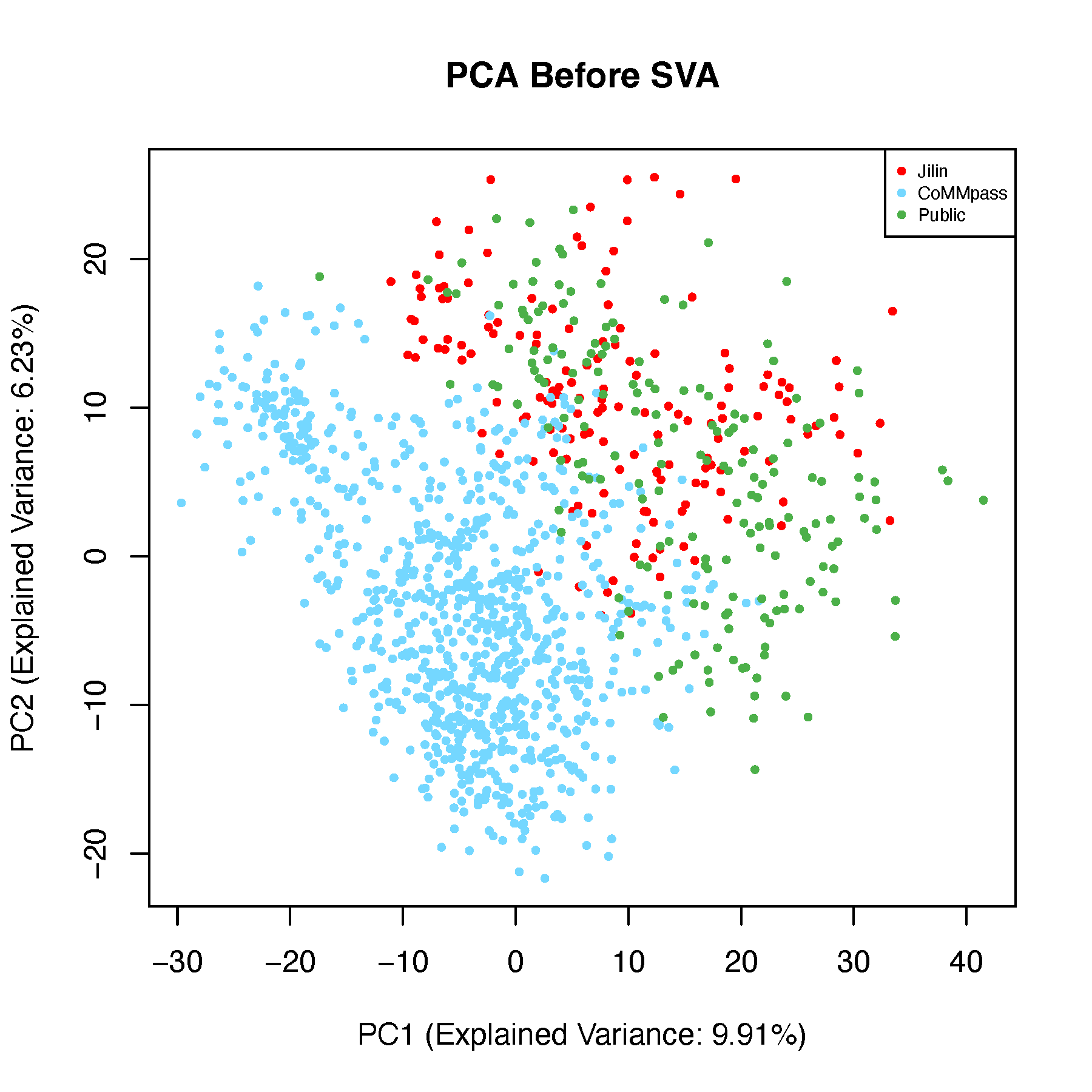
# 3D PCA Plot
pdf("pcaBeforeSVA-3d.pdf", width = 8, height = 8)
  for (ang in seq(-360, 360, by = 5)) {
    scatterplot3d(
      x = pca_before$x[, 1], y = pca_before$x[, 2], z = pca_before$x[, 3],
      main = "PCA Before SVA", color = color_before,
      type = "p", pch = 16,
      cex.symbols = 1.2,
      angle = ang, grid = TRUE, box = TRUE,
      scale.y = 1,
      col.grid = "lightblue"
    )
    legend("topright",
           legend = unique(batch),
           fill = color_before,
           box.col = "grey",
           title = "Cohorts")
  }
dev.off()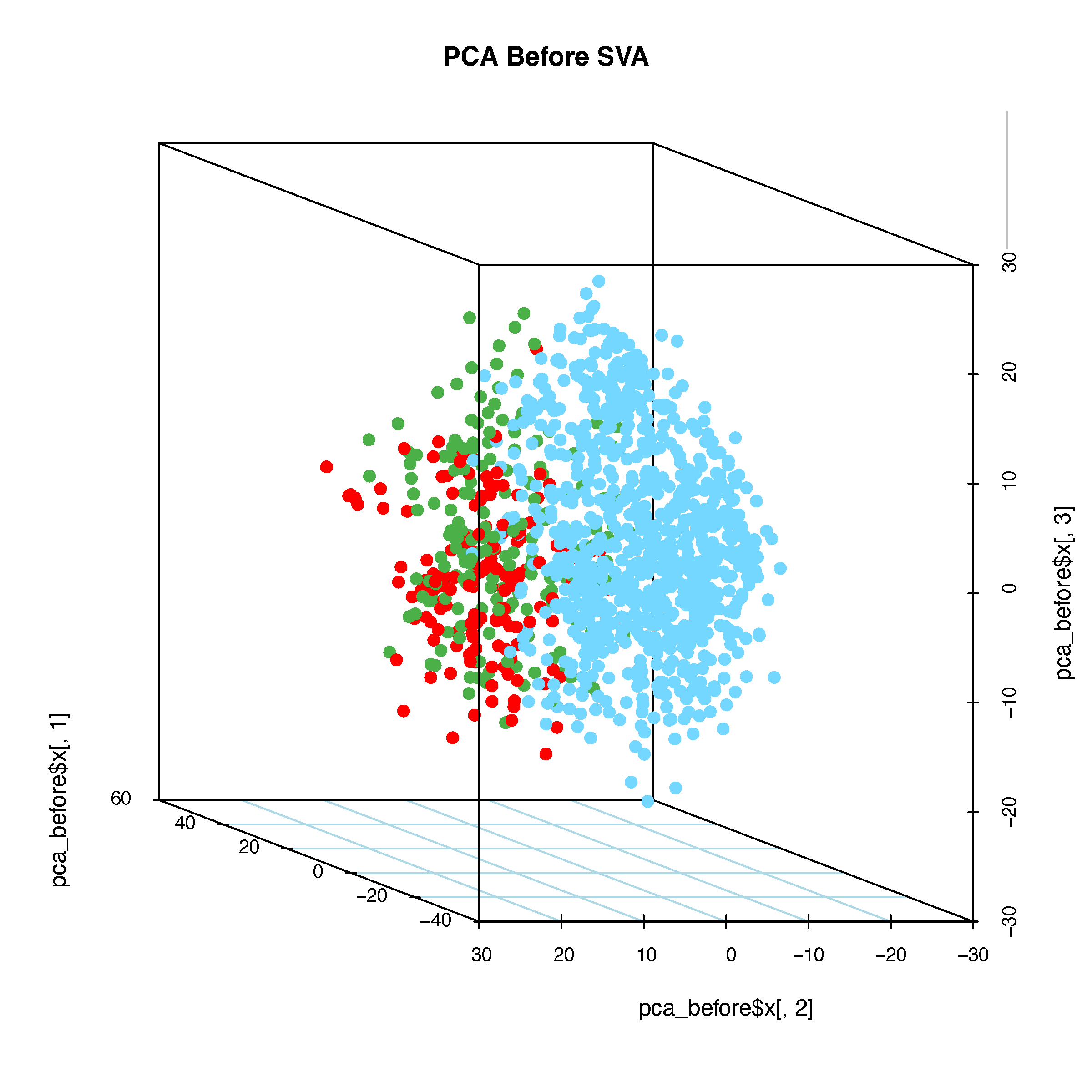
8.5.2 PCA After Batch Correction
# Perform PCA on data after batch correction
pca_after <- prcomp(dat_after_mat, scale. = TRUE)

# 2D PCA Plot
explained_var <- summary(pca_after)$importance[2, 1:2] * 100
xlab_text <- paste0("PC1 (Explained Variance: ", round(explained_var[1], 2), "%)")
ylab_text <- paste0("PC2 (Explained Variance: ", round(explained_var[2], 2), "%)")
pdf("pcaAfterSVA-2d.pdf", width = 6, height = 6)
  plot(pca_after$x[, 1:2], pch = 16, cex = 0.6,
       xlab = xlab_text, ylab = ylab_text,
       col = color_before,
       main = "PCA After SVA")
  legend("topright", legend = unique(batch),
         col = unique(color_before), pch = 16, cex = 0.6)
dev.off()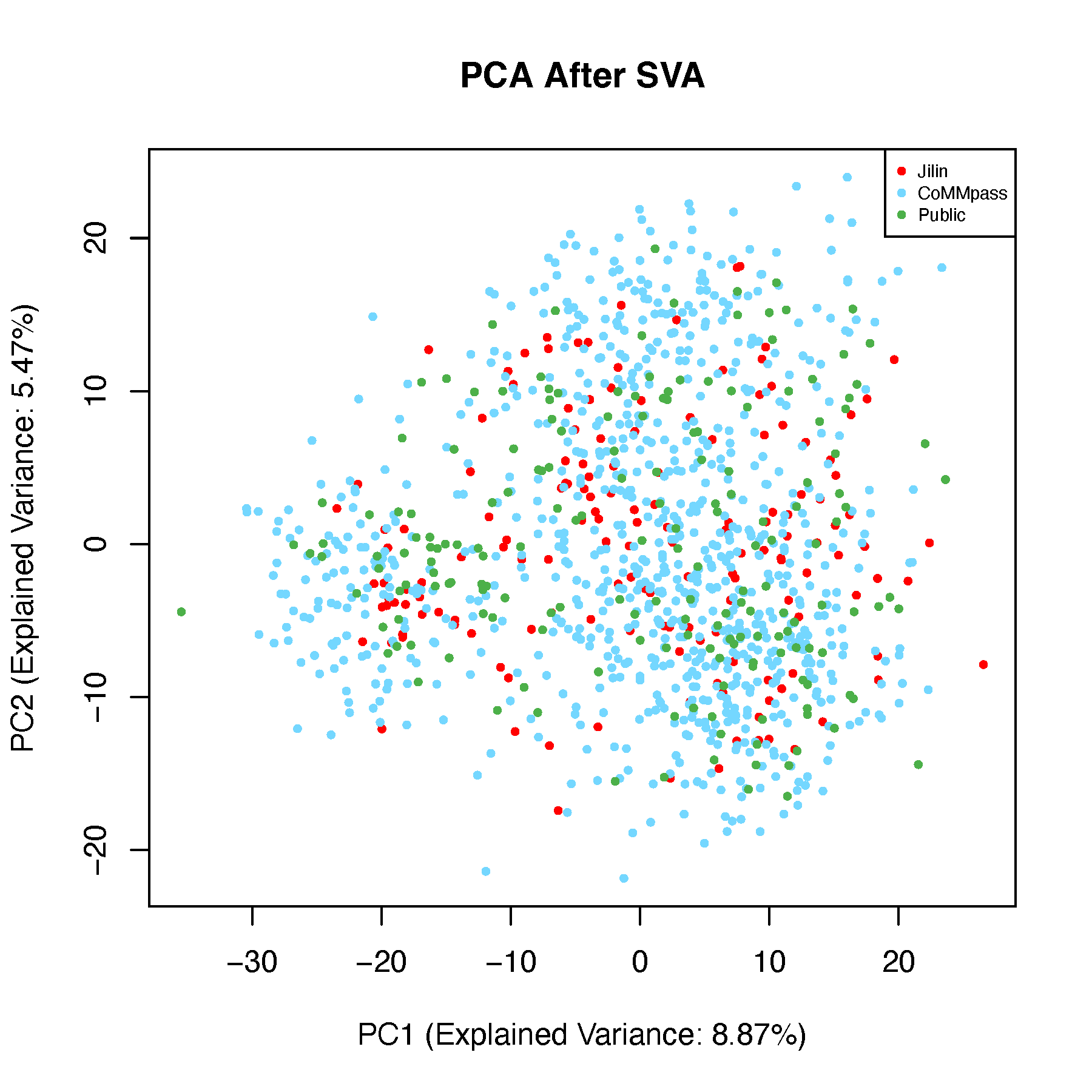
# 3D PCA Plot
pdf("pcaAfterSVA-3d.pdf", width = 8, height = 8)
  for (ang in seq(-360, 360, by = 5)) {
    scatterplot3d(
      x = pca_after$x[, 1], y = pca_after$x[, 2], z = pca_after$x[, 3],
      main = "PCA After SVA", color = color_before,
      type = "p", pch = 16,
      cex.symbols = 1.2,
      angle = ang, grid = TRUE, box = TRUE,
      scale.y = 1,
      col.grid = "lightblue"
    )
    legend("topright",
           legend = unique(batch),
           fill = color_before,
           box.col = "grey",
           title = "Cohorts")
  }
dev.off()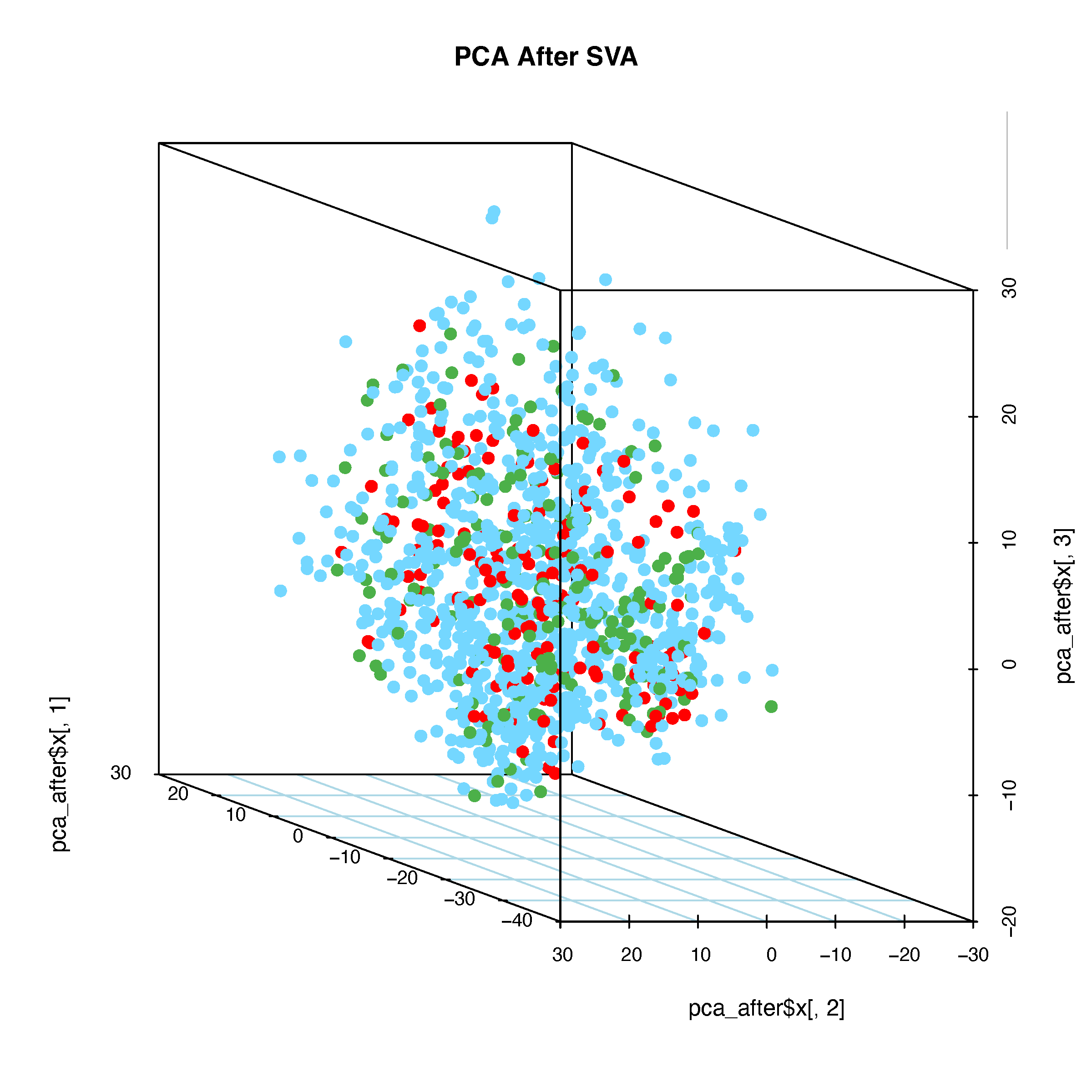
8.6 t-SNE Analysis
Perform t-SNE on the data before and after batch correction and generate 2D plots.
8.6.1 t-SNE Before Batch Correction
# Perform t-SNE on data before batch correction
tsne_before <- Rtsne(dat_before_mat, perplexity = 30, max_iter = 1000,
                     verbose = FALSE, check_duplicates = FALSE)
tsne_df <- as.data.frame(tsne_before$Y)
colnames(tsne_df) <- c("tSNE_1", "tSNE_2")
tsne_df$Cohorts <- factor(batch)
tsne_df$color <- color_before

# Plot t-SNE
pdf("tsneBeforeSVA.pdf", width = 6, height = 4)
  ggplot(tsne_df, aes(x = tSNE_1, y = tSNE_2, color = Cohorts)) +
    geom_point(size = 0.8) +
    theme_classic() +
    scale_color_manual(values = setNames(color_before, batch)) +
    guides(color = guide_legend(override.aes = list(size = 3)))
dev.off()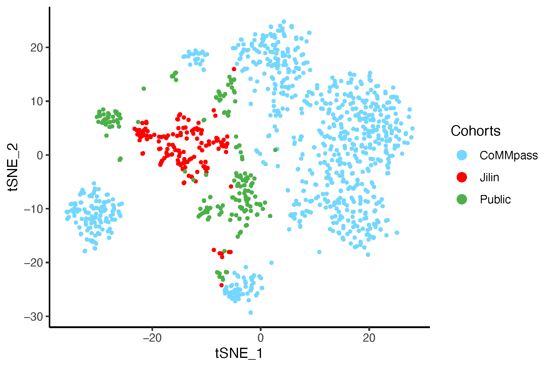
8.6.2 t-SNE After Batch Correction
# Perform t-SNE on data after batch correction
tsne_after <- Rtsne(dat_after_mat, perplexity = 30, max_iter = 1000,
                    verbose = FALSE, check_duplicates = FALSE)
tsne_df <- as.data.frame(tsne_after$Y)
colnames(tsne_df) <- c("tSNE_1", "tSNE_2")
tsne_df$Cohorts <- factor(batch)
tsne_df$color <- color_before

# Plot t-SNE
pdf("tsneAfterSVA.pdf", width = 6, height = 4)
  ggplot(tsne_df, aes(x = tSNE_1, y = tSNE_2, color = Cohorts)) +
    geom_point(size = 0.8) +
    theme_classic() +
    scale_color_manual(values = setNames(color_before, batch)) +
    guides(color = guide_legend(override.aes = list(size = 3)))
dev.off()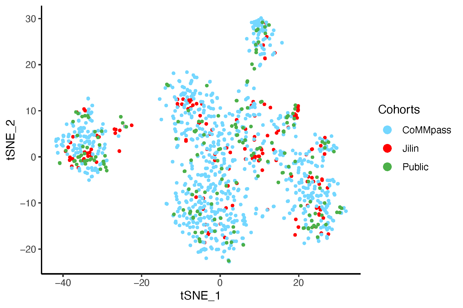
8.7 UMAP Analysis
Perform UMAP on the data before and after batch correction and generate 2D plots.
8.7.1 UMAP Before Batch Correction
# Perform UMAP on data before batch correction
umap_before <- umap(dat_before_mat, n_neighbors = 15,
                    n_components = 2, min_dist = 0.1,
                    metric = "euclidean")
umap_df <- as.data.frame(umap_before$layout)
colnames(umap_df) <- c("UMAP_1", "UMAP_2")
umap_df$Cohorts <- factor(batch)
umap_df$color <- color_before

# Plot UMAP
pdf("umapBeforeSVA.pdf", width = 6, height = 4)
  ggplot(umap_df, aes(x = UMAP_1, y = UMAP_2, color = Cohorts)) +
    geom_point(size = 0.8) +
    theme_classic() +
    scale_color_manual(values = setNames(color_before, batch)) +
    guides(color = guide_legend(override.aes = list(size = 3)))
dev.off()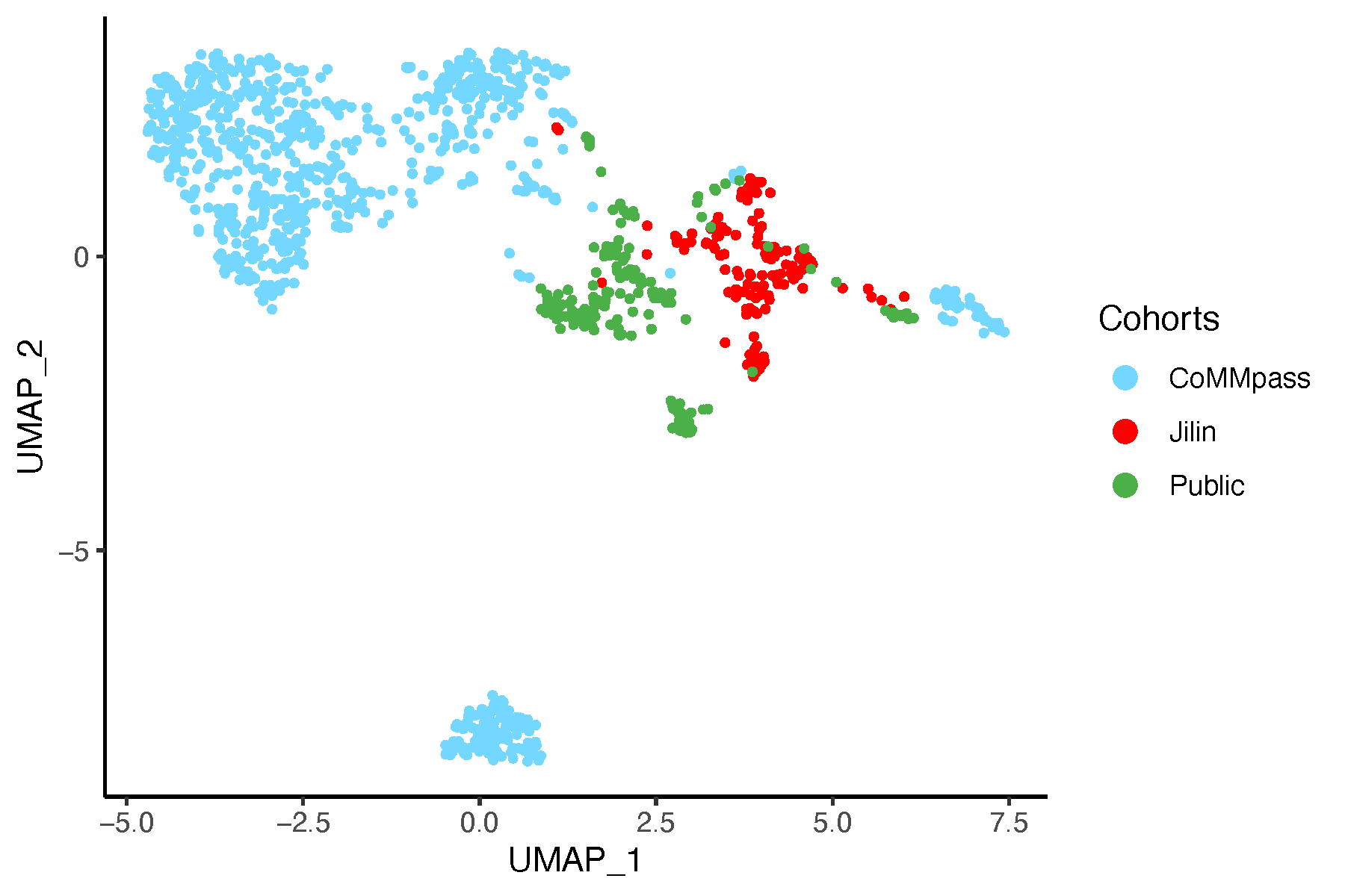
8.7.2 UMAP After Batch Correction
# Perform UMAP on data after batch correction
umap_after <- umap::umap(dat_after_mat, n_neighbors = 15,
                   n_components = 2, min_dist = 0.1,
                   metric = "euclidean")
umap_df <- as.data.frame(umap_after$layout)
colnames(umap_df) <- c("UMAP_1", "UMAP_2")
umap_df$Cohorts <- factor(batch)
umap_df$color <- color_before

# Plot UMAP
pdf("umapAfterSVA.pdf", width = 6, height = 4)
  ggplot(umap_df, aes(x = UMAP_1, y = UMAP_2, color = Cohorts)) +
    geom_point(size = 0.8) +
    theme_classic() +
    scale_color_manual(values = setNames(color_before, batch)) +
    guides(color = guide_legend(override.aes = list(size = 3)))
dev.off()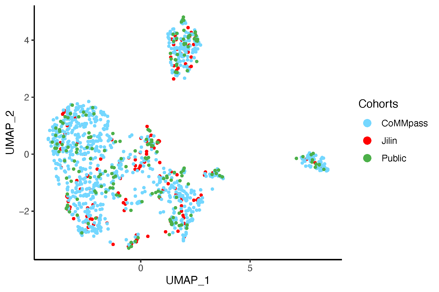
8.8 Conclusion
Based on this analysis and the resulting plots, we are confident that our approach effectively controls for batch effects in the data.